Project Name Smart Tasks
The Team & My Role
Design a new feature that allows users to create automated tasks in the HP Smart app
1 Marketing Lead, an in-house design researcher & moderator and myself, Interaction Designer.

The Challenge
Our product team needed to update the printing app, HP Smart, to appeal to and support both our fun-loving, creative consumers as well as our efficiency-minded business customers. This project introduced exciting new design challenges as our consumer team would be collaborating with our business counterparts. Beyond the visual design updates like a more refined color palette and less playful iconography, we would have to address one of the business customers’ top concerns: productivity.
“Make the HP Smart app experience more valuable to business customers without alienating our consumer base.”
The Process
Understand the user
In order to begin this project, we needed to understand exactly what productivity meant to our business customers, so I worked with my marketing partner to conduct a high-level, usertesting.com study to more closely investigate their needs. We asked small business owners who owned printers about their priorities, concerns, daily life, and printing behavior. We learned that many of our business customers were administrators and small business owners who spent large portions of their day filing and organizing.
Evaluate and audit the current experience
I conducted a deep dive into the Smart app envisioning how a feature like this would fit into our existing product. I mapped out the taps it took to complete each of those jobs using the Smart app: seventeen taps in total. Combining these into a wizard-type flow was easy, but our customers need it to be intuitive and far fewer than seventeen taps.
“What we identified was a need for a feature that would ease the burden of doing repetitive tasks such as emailing, scanning, signing, printing, digitizing, and filing.”

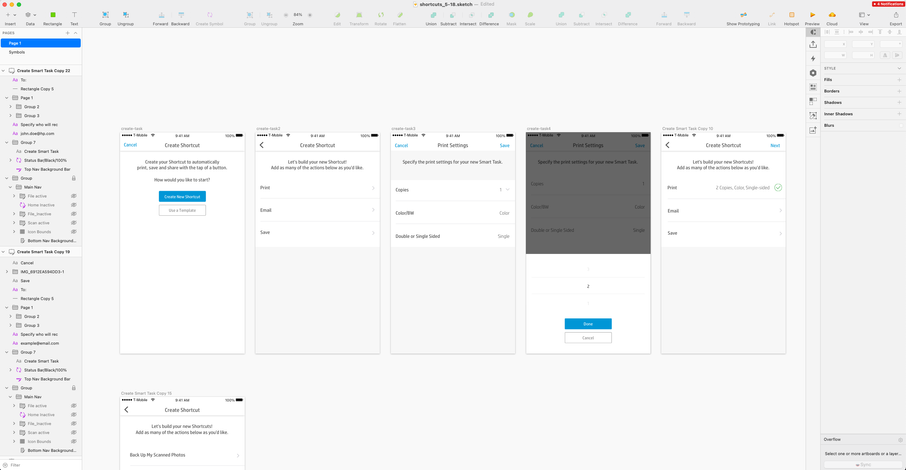
“Ultimately, the challenge was to cut down the number of taps it took to scan, print, save and send a job and then also, save those actions as one task for future use.”

Design-relevant solutions
After auditing the current experience, I conducted a competitive analysis to investigate relevant solutions that were available on the market. At the time, there was a surge in features like shortcuts and routines that were trending across companies like Apple and Amazon (Alexa Routines), so there were plenty of approaches to examine. Considering both the value and the gaps in experiences that were currently being offered, I developed a few different approaches that might work for our product.
Concept 1: Custom templates—This approach allowed a user to either select a template based on a common scenario or create one from scratch.

Concept 2: Turn on tasks—With this approach, the user has the ability to see all of their options up front and decide what they need.


Test-proposed solutions
After a series of iterations and prototypes, it was time to test a few of the initial concepts. This first round of testing focused on building a custom “Smart Task” (the name we decided to test first) and then executing it. Test participants were presented with the different design concepts, each one focusing on different ways to add and remove tasks.
What we learned was that although the templates were initially intended to be convenient, participants didn’t find them to be valuable. Additionally, the modal created to help build awareness was not effective. We ended up iterating and developing a different approach featuring animation because it was more engaging to users.
Overall, the participants had no problem creating a custom Smart Task, but our largest takeaway was that participants didn’t fully understand the feature, oftentimes even after they had created a task.
“This initial round of testing proved the concept wasn't being communicated successfully.”
Iterate and test again
The first round of user testing provided us with useful insights that gave us more clear direction on user comprehension. One of the most challenging aspects of this project was the home screen. There were two logical directions: a wizard-type flow to allow users to build as they went along or a screen that would give users something to keep coming back to.
The latter proved to be the best approach because testing showed that participants didn’t understand the feature until they saw what they had created at the end of the flow. By using this home screen approach, participants could see what they were building and keep the experience anchored by one screen that kept the tasks contextualized.

In the second round of testing, we learned that comprehension was extremely low when educational material was presented in a modal, regardless of placement, but really high when woven into the feature, providing relevant information when the user needed it—like with coach marks.
Additionally, when and where the user named their Smart Task was something that needed further consideration. Participant comprehension improved when the naming came at the end of the task. However, making the name prominent on the screen where they were building resulted in by far the highest comprehension. As a result, 12/16 participants were able to correctly guess what the feature did in the second round of testing, compared to 3/16 in round one.
Testing often provides unexpected learnings that allow us to develop concepts that we wouldn’t have considered without the feedback from users. In this case, it was the final confirmation screen. While I recognized that there would be a need to confirm to the user that the Smart Task was created, what I did not expect was that nearly 90% of participants wanted to immediately use the Smart Task they had created.
Ultimately, testing our product multiple times highlighted our strengths, weaknesses and areas of improvement. We were able to refine, remove features that didn’t resonate, and pinpoint gaps in the experience.


The Solution
After leading this project through the process of rigorous iterations and multiple rounds of user testing, I was able to deliver an experience that proved to be valuable to our business and consumer customers. We have continued to iterate and have since added even more value with fax, document signing and editing capabilities. We've also recently convinced our business partners to use the name Shortcuts... a testament to how helpful even 1 round of testing can be.
“The final deliverable was a leaner feature with high comprehension and desirability among our participants.”

Additional sources and media coverage:
https://www.youtube.com/watch?v=VMgiG9ik8fU&feature=youtu.be